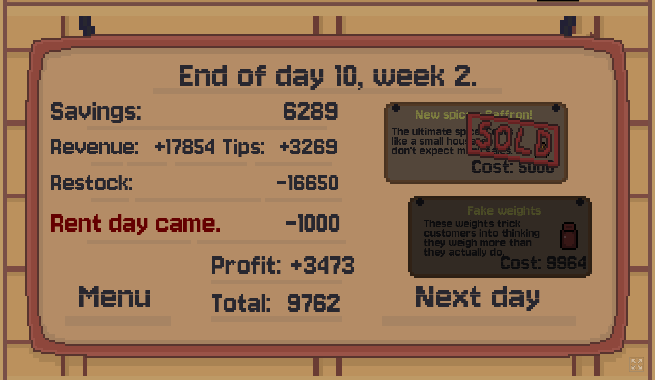
Great game! It's very much "Paper's Please with the Knapsack Problem", and even though the basic gameplay is very simple, it is delivered really well here. The ability to place weights on both sides of the scale is what makes the game click.
I managed to buy Saffron around day 6, but by that point the game became a bit too boring (which makes sense with the limited dev time). If you ever decide to make it a full game, I imagine you could add all sorts of new mechanics to "spice things up": sacks with holes that slowly leak out spice, special weights that need to be saved for special people, bonuses/penalties for finishing fast or delaying too long during each customer's turn... and of course, plot!
UX-wise, my criticism is all minor:
It's very hard to tell how much money each sale gives you and why. This information is important so that I can better decide if I e.g. prefer to sell [6/7 + 3/10] or [3/7 + 6/10]. I know the color system (white vs yellow) helps, but it doesn't help enough to figure these small details out. I also don't know if sometimes it's better to stop and do nothing rather than confirm a very bad deal.
Dragging my cursor back and forth got a bit painful for my hand after a while... some hotkeys would be nice. For example: assign the numbers 1,2, 3,4, 5,6 to the halves of the scales, then let me press 3 while hovering over a weight to automatically place that weight on the left side of the second scale.
Make it easier to remove a specific weight from the scale after it was placed. Currently they all overlap.
Wow, thanks for that detailed review! Nice analogy with the knapsack problem, I thought about it while developing the system, but forgot the actual name of it.
Your ideas for potential new mechanics are all interesting, those are all interesting ways to solve current design problems, as well as add different tasks for the player.
UX additions are also great! 1. I agree that current profit display on scales should be reworked: right now this information is placed in small font under the scales ("Salt buy/sale: 15/17, Current profit: +152" for example), but that's not really UX friendly. 2. I love the hotkeys idea, and I think it's the best way to implement them like that. 3. Regarding overlapping, I believe new version of Godot helps solve that problem a bit (at least now player will be able to pick up the front weight first), but for fixing overlaps, I might have an idea or two on how to resolve them~
Thanks a bunch for taking your time to play our game, and most importantly - to write this review to us, it means a lot!
I wasn't sure about this game at first, but it quickly becomes very addicting! (or maybe it's just me... I really like math) The art, sound, and gameplay are all great! I am very surprised that this game is not more popular.
← Return to game
Comments
Log in with itch.io to leave a comment.
Great game! It's very much "Paper's Please with the Knapsack Problem", and even though the basic gameplay is very simple, it is delivered really well here. The ability to place weights on both sides of the scale is what makes the game click.
I managed to buy Saffron around day 6, but by that point the game became a bit too boring (which makes sense with the limited dev time). If you ever decide to make it a full game, I imagine you could add all sorts of new mechanics to "spice things up": sacks with holes that slowly leak out spice, special weights that need to be saved for special people, bonuses/penalties for finishing fast or delaying too long during each customer's turn... and of course, plot!
UX-wise, my criticism is all minor:
Thanks for making it!
Wow, thanks for that detailed review! Nice analogy with the knapsack problem, I thought about it while developing the system, but forgot the actual name of it.
Your ideas for potential new mechanics are all interesting, those are all interesting ways to solve current design problems, as well as add different tasks for the player.
UX additions are also great!
1. I agree that current profit display on scales should be reworked: right now this information is placed in small font under the scales ("Salt buy/sale: 15/17, Current profit: +152" for example), but that's not really UX friendly.
2. I love the hotkeys idea, and I think it's the best way to implement them like that.
3. Regarding overlapping, I believe new version of Godot helps solve that problem a bit (at least now player will be able to pick up the front weight first), but for fixing overlaps, I might have an idea or two on how to resolve them~
Thanks a bunch for taking your time to play our game, and most importantly - to write this review to us, it means a lot!
Wow! cool game! pretty design
Pretty cool design. I've never seen this type of games before, so it was kinda interesting to play in it. 10/10 ^-^
Someday I'll buy those weights
+++ I've almost saved up, I think I'll buy them tomorrow
I wasn't sure about this game at first, but it quickly becomes very addicting! (or maybe it's just me... I really like math) The art, sound, and gameplay are all great! I am very surprised that this game is not more popular.
Also, the fake weights are hilarious.
Impressive profit stats, and congratulations on buying saffron! And of course, thanks for playing our game!
Fake weights really be tricking everyone, not just customers, huh?